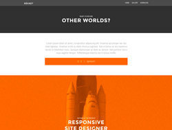
Stellar Responsive Websites
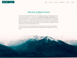
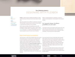
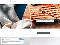
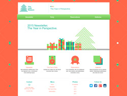
This theme uses a bunch of design techniques that are surprisingly easy to pull off with Responsive Site Designer. Each section consists of a row with a background image and single column. The column is transparent but becomes visible on hover. A mini navigation with thumbnail images allows for a cool scroll to the different sections.
Get Responsive Site Designer Already »